
A good logo is simple, legible at any size, distinctive and timeless enough to serve you for years. What makes a good logo can be checked yourself with seven criteria and a few tests. You do not need design training, only the logo, a screen and a few minutes.
Which seven criteria make a good logo?
A logo has a practical job: it should make your business quickly recognisable, on a business card as much as on a company van. The table summarises seven criteria with a quick test for each.
| Criterion | Question | Quick test |
|---|---|---|
| Simplicity | Can you sketch it from memory? | Sketch it after five seconds of viewing |
| Scalability | Is it recognisable small and large? | Display it at 16 pixels wide |
| Distinctiveness | Does it look different from competitors? | Place the five nearest competitors' logos next to it |
| Legibility | Is the name easy to read? | View it on a phone at arm's length |
| One-colour use | Does it work in black and white? | Set the saturation to zero |
| Timelessness | Does it stand up without effects? | Remove shadows, gradients and special effects |
| Fit | Does it suit your offer and audience? | Ask three customers what they associate with it |
How do you test scalability and one-colour use?
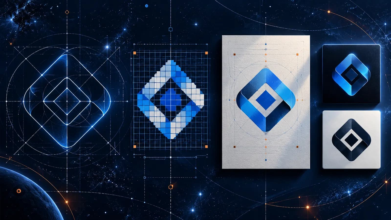
Reduce the logo to 16 pixels wide, the size of a browser favicon. If it becomes a smudge, it needs a simplified mark for small uses. Then enlarge it to poster size. With a clean vector file the lines stay sharp; with a pixel file they do not.
Next, show the logo in one colour, black on white and white on black. If it looks generic without colour, its recognisability depends too much on colour. That becomes a problem with stamps, engraving and black-and-white copies.
Logotypes are exempt from the contrast requirements of accessibility guidelines. You should still check legibility on screen, for instance on light and dark backgrounds.
How distinctive must a logo be?
A logo has to set you apart from competitors in your region and trade. Place the logos of your five nearest competitors beside your own. If all of them use a cog, a leaf or a blue circle, you lack distinctiveness, however clean the design.
Also check whether a similar mark is already protected as a trade mark. The register of the German Patent and Trade Mark Office and the European search tool TMview give first pointers. This does not replace legal advice, but it prevents unpleasant surprises.
What does timeless mean for a logo?
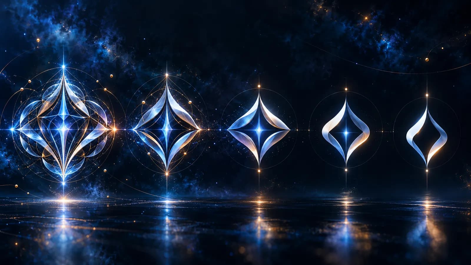
Timeless does not mean dull; it means free of effects that give away a fashion. Gradients, drop shadows or distortions date quickly and are hard to reproduce in print. A clear mark with good proportions stays usable for a long time.
Timeless also does not mean a logo can never be adjusted. Small corrections, such as stroke weight or spacing, keep it current. Our article When to rebrand: when a new brand really makes sense explains when a bigger revision is needed.
- The logo can be sketched after a short look
- Still recognisable at 16 pixels wide, or a simplified variant exists
- Legible in one colour, black and white
- Tested on light and dark backgrounds
- Compared with the logos of the main competitors
- Trade mark register checked for similar marks
- Vector file and variants are available
Conclusion: good is what works every day
A good logo proves itself not in the draft but on the business card, in the browser tab and on the company van. If it meets the seven criteria, you can work with it with confidence. Our article on logo file formats explains which files you need. If you want to revise your logo or have a new one developed, see our branding service or get in touch.