
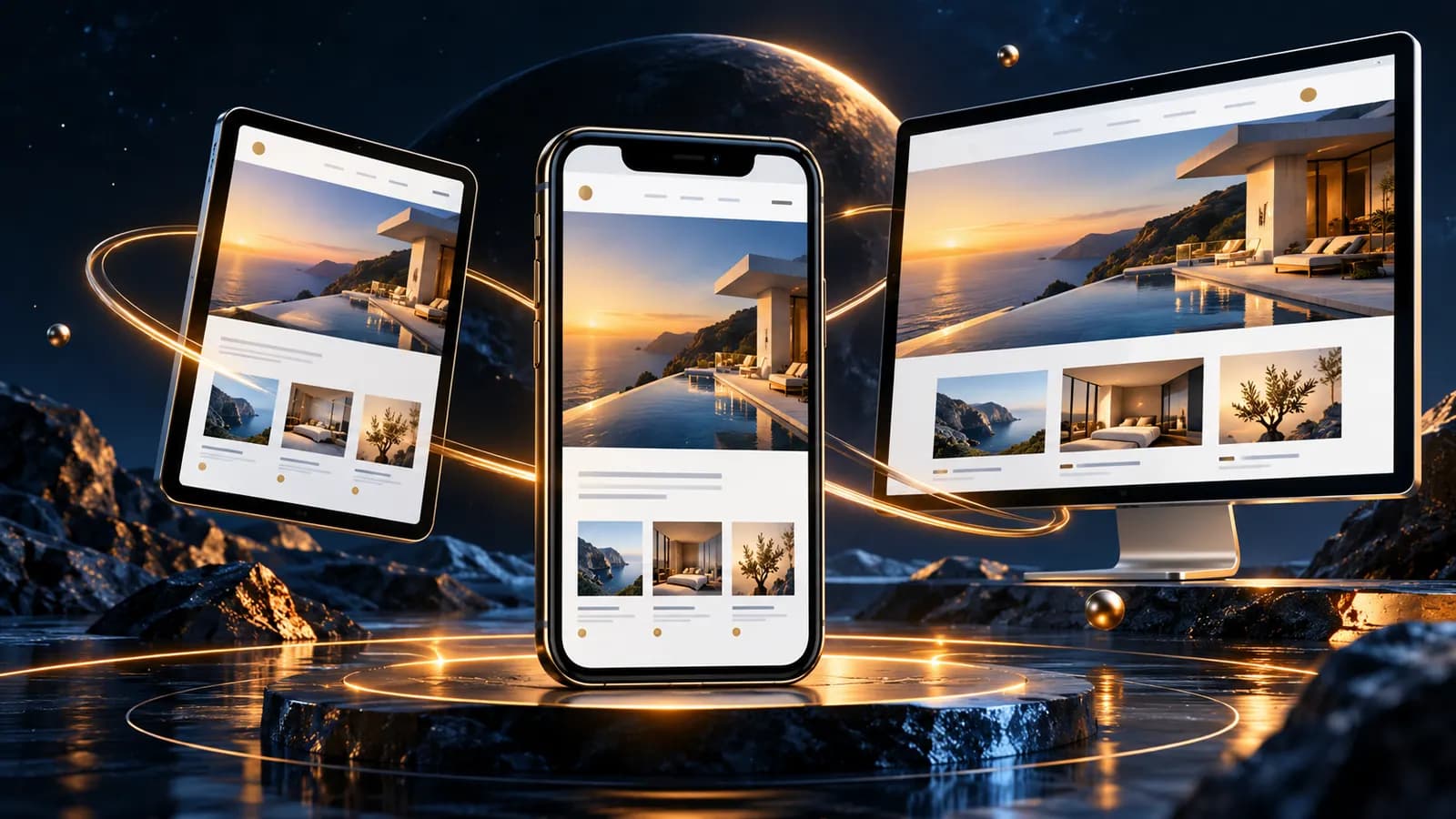
Mobile-first design means you plan your website for the small screen first and only then for tablet and desktop. The smartphone is the starting point, not a reduced version. It sounds like a small difference, but it shapes the content, the structure and the load time of your entire website.
In this article we explain why so many visitors arrive on their phones, how to think about a small screen, what the thumb zone is, and why it matters to Google.
Why do so many visitors start on their phone?
When did you last open a website to look something up or book an appointment? Most likely on the go, standing on a station platform or on the sofa in the evening. For many websites, the phone screen is the entry point, long before anyone sits down at a desk.
If your website only works well on desktop, many of your visitors reach it only after a detour. And if it loads slowly or is fiddly to use on a phone, many people are gone after a few seconds.
How do you plan a website for a small screen?
Mobile-first is not a design style, it is a question of order. You start with the narrowest frame and work your way up:
- Content first: Not everything fits on a small screen. So from the start you decide what actually matters and what can go.
- Short sentences, clear paragraphs: Running text that works as a column on desktop turns into a wall of text on a phone.
- One central action per page: One button, one number, one form, not three goals at once.
- Navigation in the thumb zone: The key items sit where the thumb rests naturally in the lower part of the screen.
The rule of thumb: if it works on a smartphone, it works everywhere, if it only works on desktop, it will miss many visitors.
Why does speed matter so much on a phone?
Phones are more often on mobile data or unreliable Wi-Fi than desktops are on fibre. Every unoptimised image costs noticeable time, and visitors who have to wait tap back and keep searching.
Mobile-first design helps automatically, because the smallest version is lean by design: fewer images, less code, fewer elements to load. The desktop version then gets more room, but the foundation stays light.
| Criterion | Mobile-first | Desktop-first |
|---|---|---|
| Content | Reduced to the essentials | Everything first, then trimmed |
| Navigation | Thumb-friendly, simple paths | Complete, with full menus |
| Load time | Lean from the start | Often optimised after the fact |
| Risk | Low | Important content is lost on phones |
What does this have to do with Google?
Google evaluates websites primarily in their mobile version: this is called mobile-first indexing. If the phone version is slow or missing content, it can affect your ranking, even for people searching on desktop.
The good news: you do not need to do anything special for Google. Plan mobile-first from the start, and you meet many of the key criteria almost automatically, clear content, short load times, and usability that works on a small screen.
Checklist: is my website mobile-first?
- The most important content is visible on a phone without scrolling
- All buttons and forms sit within thumb reach
- The website loads quickly on a phone, even over mobile data
- Texts are short enough to stay readable on a small screen
- There is exactly one clear action per page
- The mobile version in Google matches the desktop version, no less
Conclusion: mobile-first means starting with the smallest screen
Mobile-first design is not a trend; it follows from where your visitors are. You plan for the small screen first, cut back to the essentials, use the thumb zone and keep load times low and lay a good foundation for Google as well.
If you are not sure whether your current website is mobile-first, talk it through with us. We will show you what works on a small screen and what does not yet. For the bigger picture of how a platform is built from scratch, see our overview of digital platforms. We are based in Dresden and work with clients across Germany, Europe and worldwide.